GreenAsh 3.0: how did they do it?
After much delay, the stylish new 3rd edition of GreenAsh has finally hit the web! This is the first major upgrade that GreenAsh has had in almost 2 years, since it was ported over from home-grown CMS (v1) to Drupal (v2). I am proud to say that I honestly believe this to be the cleanest (inside and out), the most mature, and the sexiest edition to date. And as you can see, it is also one of the biggest upgrades that the site has ever had, and possibly the last really big upgrade that it will have for quite some time.
The site has been upgraded from its decaying and zealously hacked Drupal 4.5 code base, to the latest stable (and much-less-hacked) 4.7 code base. This fixes a number of security vulnerabilities that previously existed, as well as bringing the site back into the cutting edge of the Drupal world, and making it compatible with all the latest goodies that Drupal has to offer.
New theme
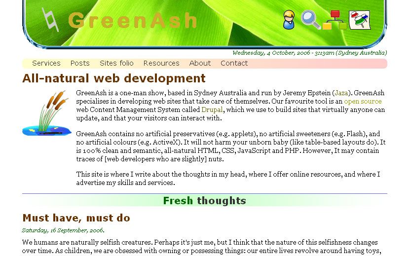
GreenAsh 3.0 sports a snazzy new theme, complete with fresh branding, graphics, and content layout. The new theme is called Lorien, and as with previous site designs, it gives GreenAsh a public face using nothing but accessible, validated, and standards-compliant markup:

GreenAsh 2.0 was styled with the Mithrandir theme:

And GreenAsh 1.0, which was not Drupal-powered, did not technically have a 'theme' at all; but for historical purposes, let's call its design the GreenAsh theme:

New modules
GreenAsh 3.0 is also using quite a few new modules that are only available in more recent versions of Drupal. The views module is being used to generate custom node listings in a number of places on the site, including for all of the various bits that make up the new front page, and also for the revamped recent posts page. The pathauto module is now generating human-readable URLs for all new pages of the site, in accordance with the site's navigation structure. Because the URL format of the site's pages has changed, a number of old URLs are now obselete, and these are being redirected to their new equivalents, with the help of the path redirect module.
The improved captcha module is providing some beginner-level maths questions to all aspiring new users, anonymous commenters, and anonymous contact form submitters, and is proving to be an effective combatant of spam. Also, the very nifty nice menus module is being used for administrator-only menus, to provide a simple and unobtrusive navigational addition to the site when needed.
Best of all, the site has finally been switched over to the category module, which was built and documented by myself, and which had the purpose from the very beginning of being installed right here, in order to meet the hefty navigational and user experience demands that I have placed upon this site. Switching to the category module was no small task: it required many hours of careful data migration, site re-structuring, and menu item mayhem. I certainly do not envy anyone who is making the switch from a taxonomy or book installation to a category module installation. But, despite the migration being not-for-the-faint-hearted, everything seems to be running smoothly now, and the new system is providing a vastly improved end-user and site administrator experience.
New user experience
I have implemented a number of important changes to the user experience of the site, which will hopefully make your visit to the site more enjoyable and useful:
- Re-designed front page layout
- Switch to a simple and uncluttered 1-column layout for all other pages
- New category-module-powered navigation links and table-of-contents links
- Automatic new user account approval after 72 hours
- Removed a number of pages from the site's hierarchy, to reduce unnecessary information overload
Ongoing effort
Obviously, there are still a number of loose ends to tie up. For example, the content on some pages may still require updating. Additionally, some pages are still yet to be added (such as the listings in the sites folio). Further tweaks and adjustments will probably also be made to the look and feel of the site in the near future, to continue to improve it and to make it distinctly branded.
Feedback, comments, suggestions, criticisms, cookies, cakes, donations, and lingerie are all welcome to be thrown my way. Throwing apple cores is discouraged: if you think the new site stinks that badly, why not be constructive and throw a can of deodorant instead? Anyway, I really do hope you all like the site post-upgrade, and I wish you all the best in your exploration of the new and improved GreenAsh 3.0!